04-ggplot2
Data Visualization with ggplot2
Q&A
Q: I’m curious about the differences between base r pipe (|>) and the %>% operators! I’ve only learned about %>% and it’d be interesting looking at the differences between using either one.
A: There’s a blog post for that!
Q: The most confusing part of this lecture was getting started with dplyr functions, but it will become easier with practice.
A: Lots of people said something similar. And, this is definitely the right attitude! Lecture is for first exposure. Practice in lecture is to start underestanding. Labs are for guided practice where you have more time to practice. Case studies and homeworks are where we check our understanding! So, you’re not supposed to “get it” all the first time you see it in lecture.
Course Announcements
Due Dates:
- Lab 02 due Thursday (11:59 PM)
- Lecture Participation survey “due” after class
Notes:
- HW02 now available; Lab03 posted Th
Suggested Reading
- R4DS Chapter 9: Data Visualization
- Data to Viz: https://www.data-to-viz.com/
ggplot2 \(\in\) tidyverse
- ggplot2 is tidyverse’s data visualization package
- Structure of the code for plots can be summarized as
ggplot(data = [dataset],
       mapping = aes(x = [x-variable],
                     y = [y-variable])) +
   geom_xxx() +
   other options
Data: CS01 WB
WB <- read_csv("https://github.com/ShanEllis/datasets/raw/refs/heads/master/Blood.csv")The Data
WB |>
  datatable()
The Cleaning
Note: this is the code from the end of 03-dplyr notes, combined into a single chunk.
WB <- WB |>
  mutate(Treatment = fct_recode(Treatment,
                                "5.9% THC (low dose)" = "5.90%",
                                "13.4% THC (high dose)" = "13.40%"),
         Treatment = fct_relevel(Treatment, "Placebo", "5.9% THC (low dose)")) |>
  janitor::clean_names() |>
  rename(thcoh = x11_oh_thc,
         thccooh = thc_cooh,
         thccooh_gluc = thc_cooh_gluc,
         thcv = thc_v) |>
  mutate(timepoint = case_when(time_from_start < 0 ~ "pre-smoking",
                               time_from_start > 0 & time_from_start <= 30 ~ "0-30 min",
                               time_from_start > 30 & time_from_start <= 70 ~ "31-70 min",
                               time_from_start > 70 & time_from_start <= 100 ~ "71-100 min",
                               time_from_start > 100 & time_from_start <= 180 ~ "101-180 min",
                               time_from_start > 180 & time_from_start <= 210 ~ "181-210 min",
                               time_from_start > 210 & time_from_start <= 240 ~ "211-240 min",
                               time_from_start > 240 & time_from_start <= 270 ~ "241-270 min",
                               time_from_start > 270 & time_from_start <= 300 ~ "271-300 min",
                               time_from_start > 300 ~ "301+ min"))
Why are there two mutates? Could they have all been in a single mutate?
A Plot

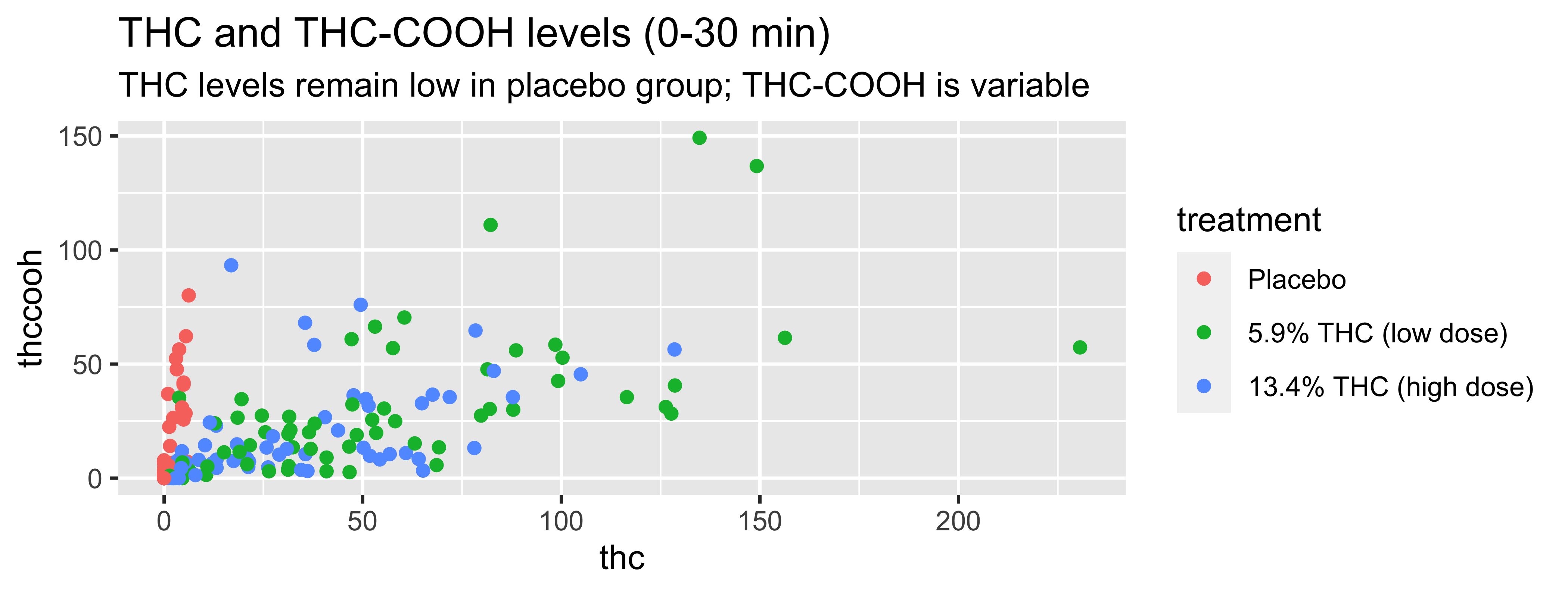
WB |>
  filter(timepoint=="0-30 min") |>
  ggplot(., mapping = aes(x = thc, y = thccooh,
                       color = treatment)) +
    geom_point() +
    labs(title = "THC and THC-COOH levels (0-30 min)",
         subtitle = "THC levels remain low in placebo group; THC-COOH is variable",
         x = "THC (ng/mL)", y = "THC-COOH (ng/mL)",
         color = "Treatment Group") +
    scale_color_viridis_d()
Coding out loud
Start with the
WBdata frame (filtering to only include first timepoint)
WB |>
  filter(timepoint=="0-30 min") |>
ggplot() 
Start with the
WBdata frame, map thc levels to the x-axis
Start with the
WBdata frame, map thc levels to the x-axis and map thccooh levels to the y-axis.
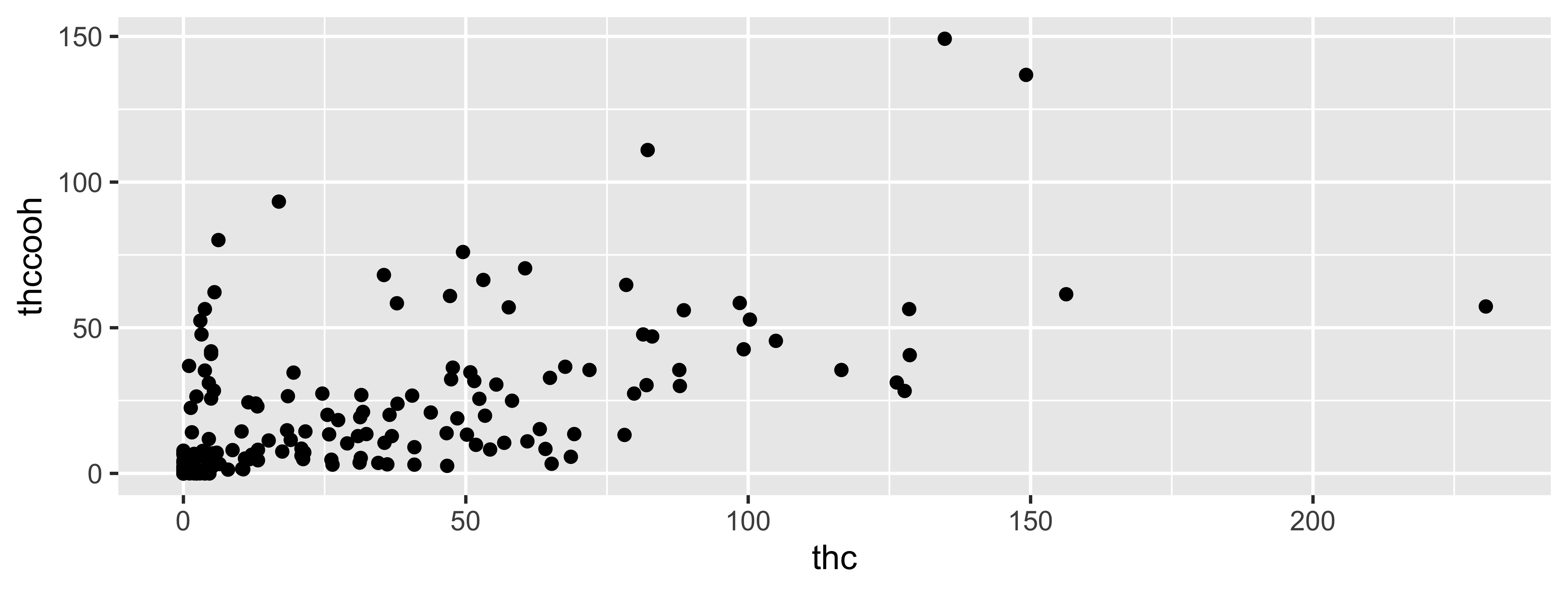
Start with the
WBdata frame, map thc levels to the x-axis and map thccooh levels to the y-axis. Represent each observation with a point.
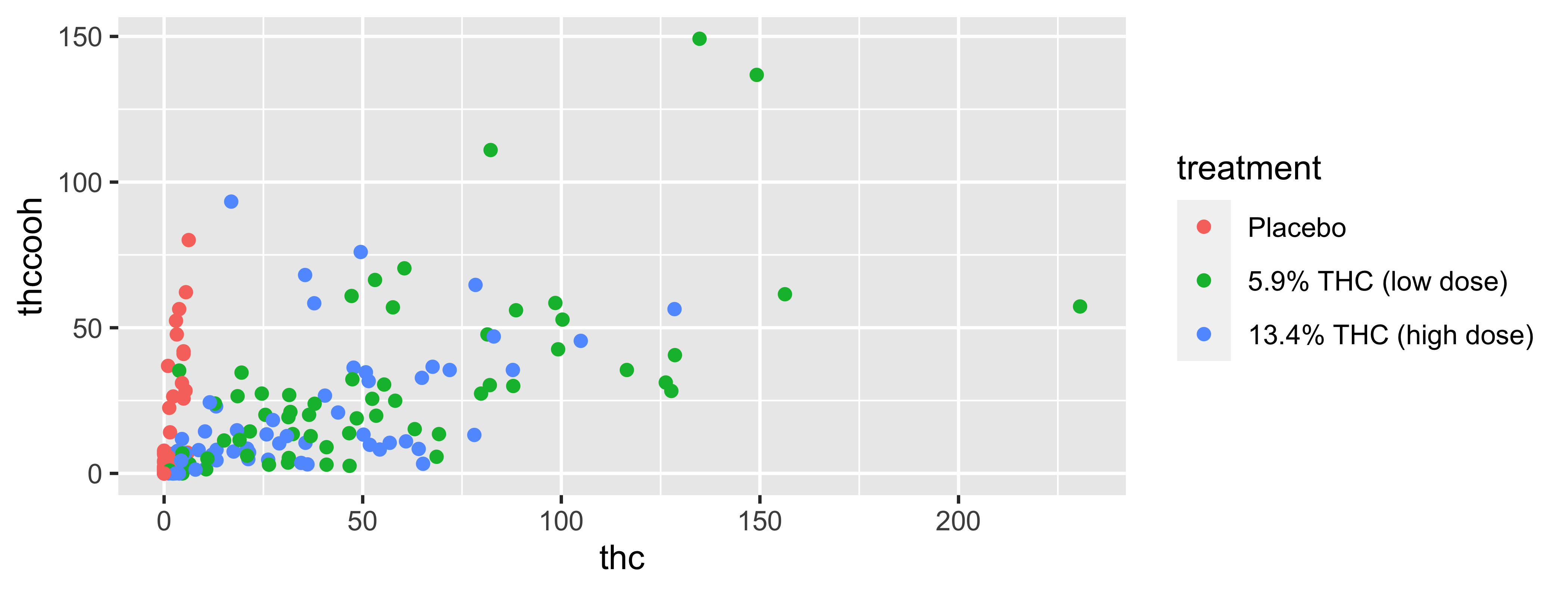
Start with the
WBdata frame, map thc levels to the x-axis and map thccooh levels to the y-axis. Represent each observation with a point and map treatment group to the color of each point.
Start with the
WBdata frame, map thc levels to the x-axis and map thccooh levels to the y-axis. Represent each observation with a point and map treatment group to the color of each point. Title and subtitle the plot.
Start with the
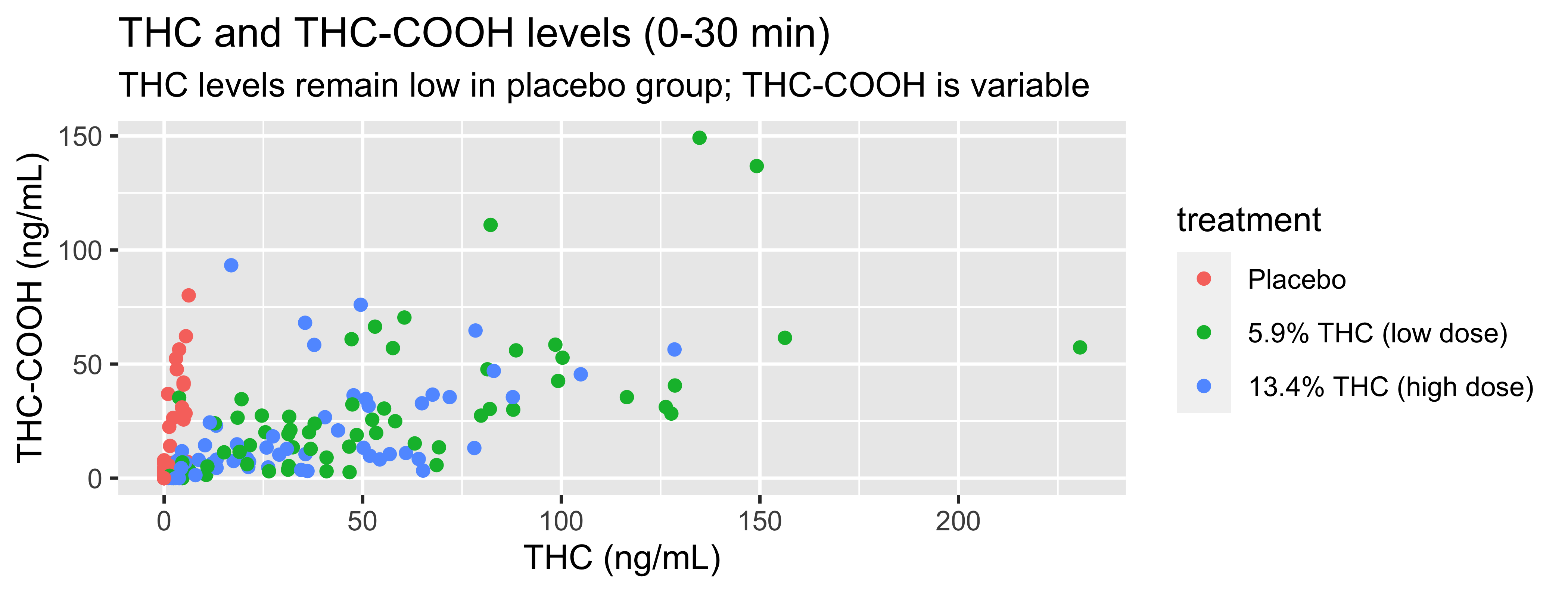
WBdata frame, map thc levels to the x-axis and map thccooh levels to the y-axis. Represent each observation with a point and map treatment group to the color of each point. Title and subtitle the plot, label the x and y axes
Start with the
WBdata frame, map thc levels to the x-axis and map thccooh levels to the y-axis. Represent each observation with a point and map treatment group to the color of each point. Title and subtitle the plot, label the x and y axes, and title the legend.
WB |>
  filter(timepoint=="0-30 min") |>
  ggplot(., mapping = aes(x = thc, y = thccooh,
                       color = treatment)) +
    geom_point() +
    labs(title = "THC and THC-COOH levels (0-30 min)",
         subtitle = "THC levels remain low in placebo group; THC-COOH is variable",
         x = "THC (ng/mL)", y = "THC-COOH (ng/mL)",
color = "Treatment Group") 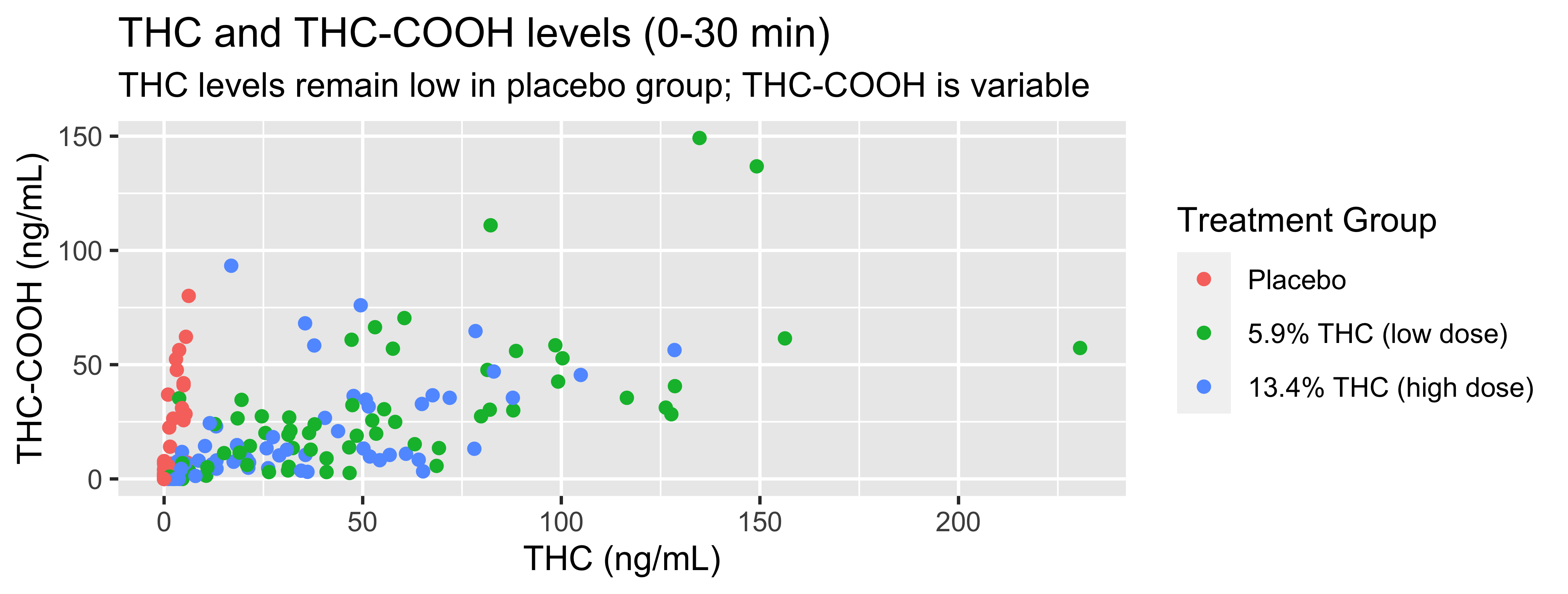
Start with the
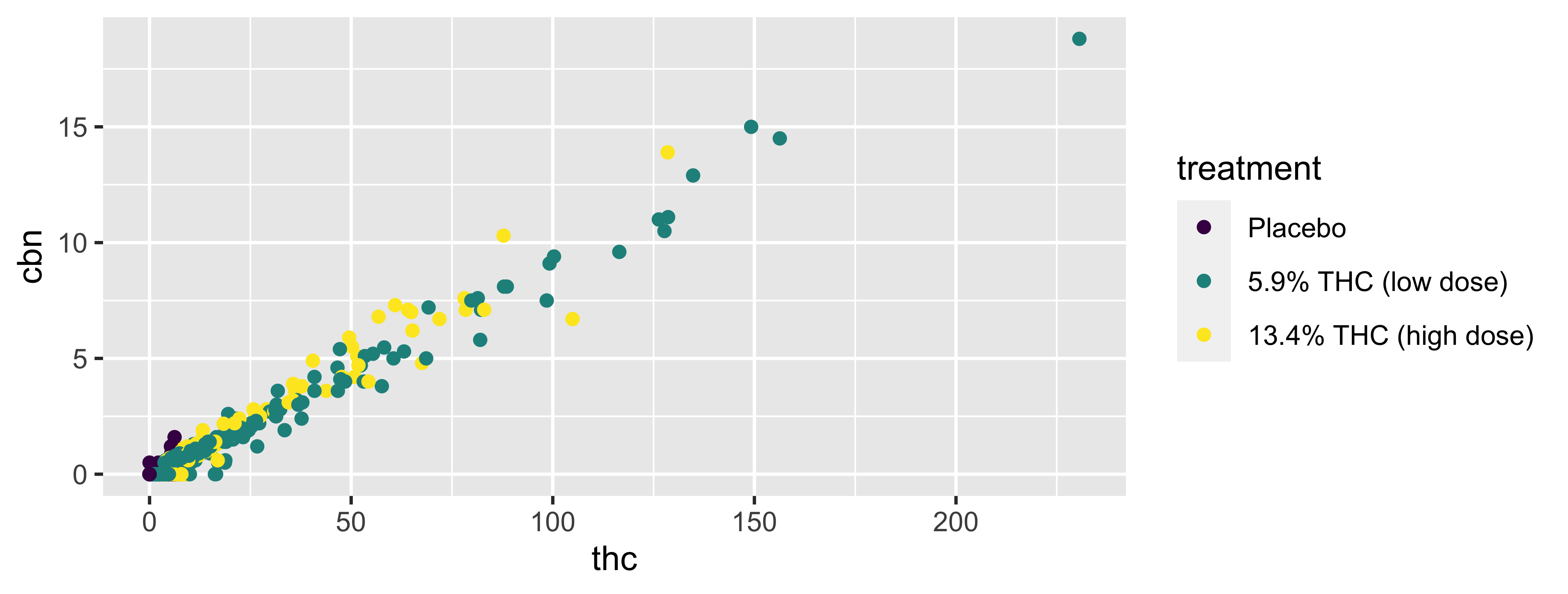
WBdata frame, map thc levels to the x-axis and map thccooh levels to the y-axis. Represent each observation with a point and map treatment group to the color of each point. Title and subtitle the plot, label the x and y axes, and title the legend. Finally, use a discrete color scale that is designed to be perceived by viewers with common forms of color blindness.
WB |>
  filter(timepoint=="0-30 min") |>
  ggplot(., mapping = aes(x = thc, y = thccooh,
                       color = treatment)) +
    geom_point() +
    labs(title = "THC and THC-COOH levels (0-30 min)",
         subtitle = "THC levels remain low in placebo group; THC-COOH is variable",
         x = "THC (ng/mL)", y = "THC-COOH (ng/mL)",
         color = "Treatment Group") +
    scale_color_viridis_d()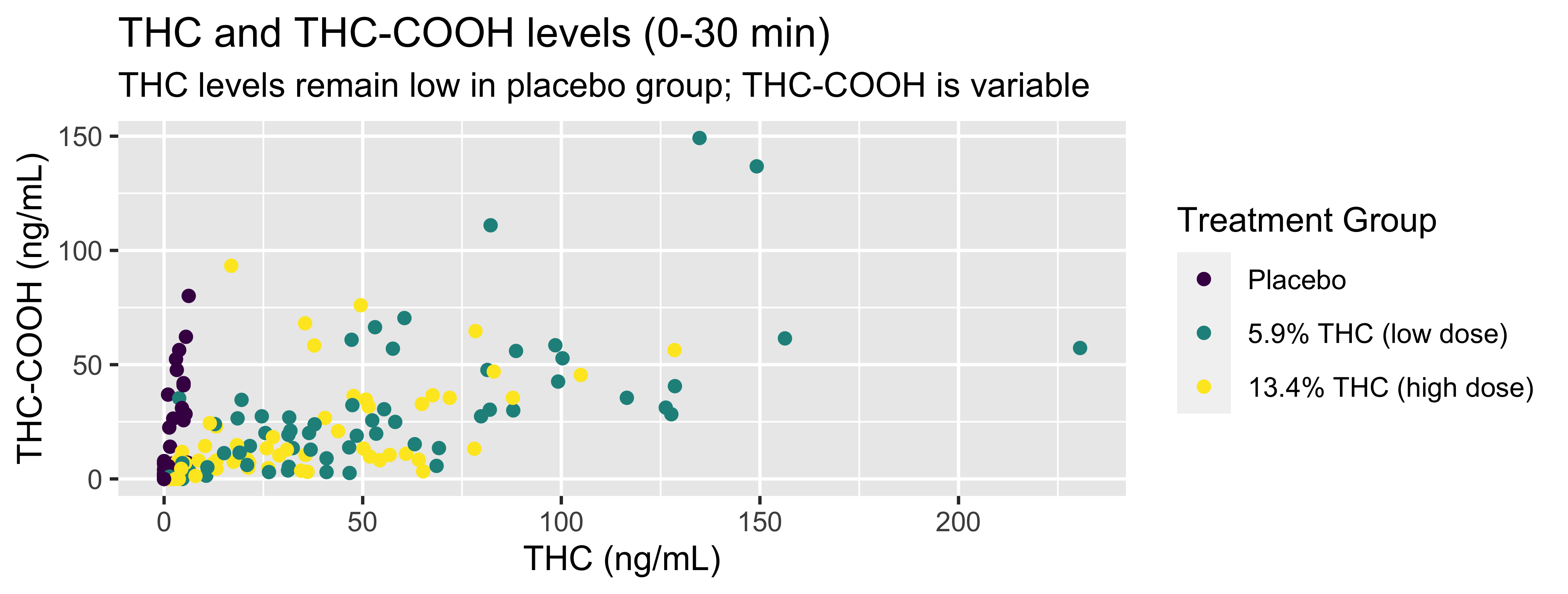
Coding out loud
WB |>
  filter(timepoint=="0-30 min") |>
  ggplot(., mapping = aes(x = thc, y = thccooh,
                       color = treatment)) +
    geom_point() +
    labs(title = "THC and THC-COOH levels (0-30 min)",
         subtitle = "THC levels remain low in placebo group; THC-COOH is variable",
         x = "THC (ng/mL)", y = "THC-COOH (ng/mL)",
         color = "Treatment Group") +
    scale_color_viridis_d()
Start with the WB data frame, map thc levels to the x-axis and map thccooh levels to the y-axis.
Represent each observation with a point and map treatment group to the color of each point.
Title and subtitle the plot, label the x and y axes, and title the legend.
Finally, use a discrete color scale that is designed to be perceived by viewers with common forms of color blindness.
Argument names
You can omit the names of first two arguments when building plots with ggplot().
Your Turn
Generate a basic plot in ggplot2 using different filtering and/or variables than those in the last example (last example: thc & thccoooh, “0-30 min” timepoint).
Put a green sticky on the front of your computer when you’re done. Put a pink if you want help/have a question.
Aesthetics
Aesthetics options
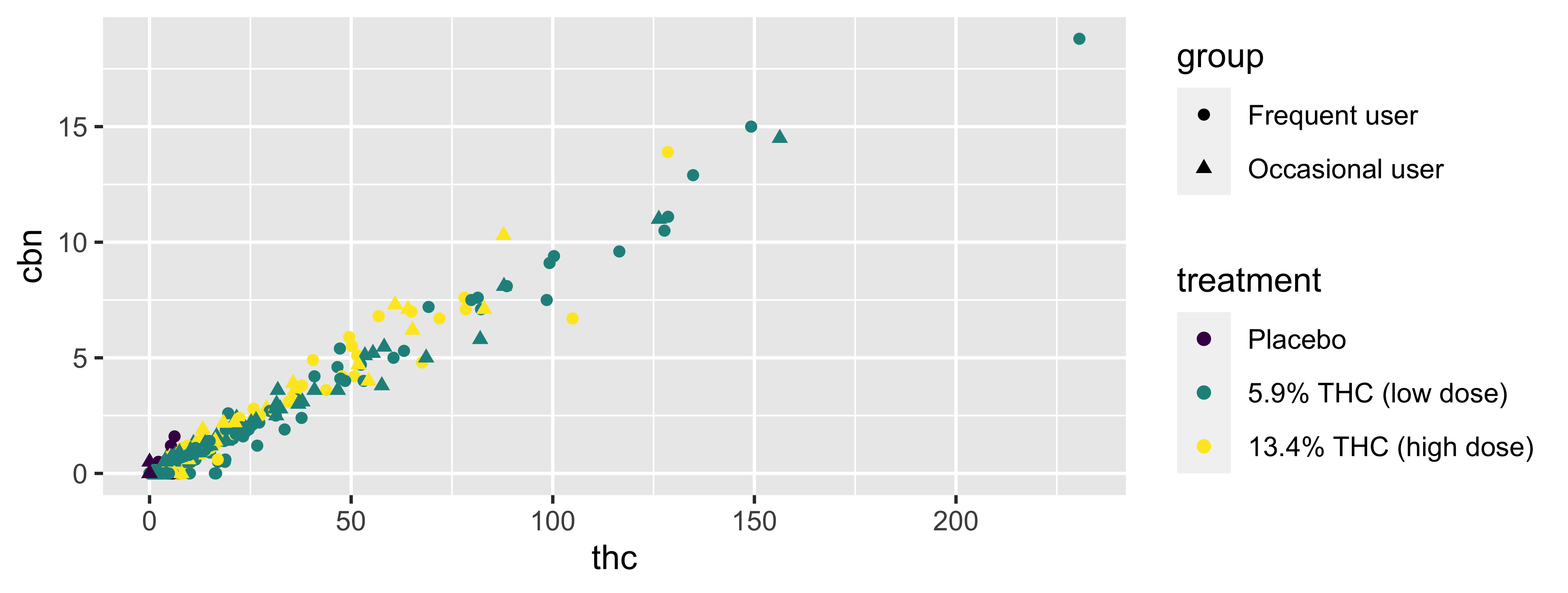
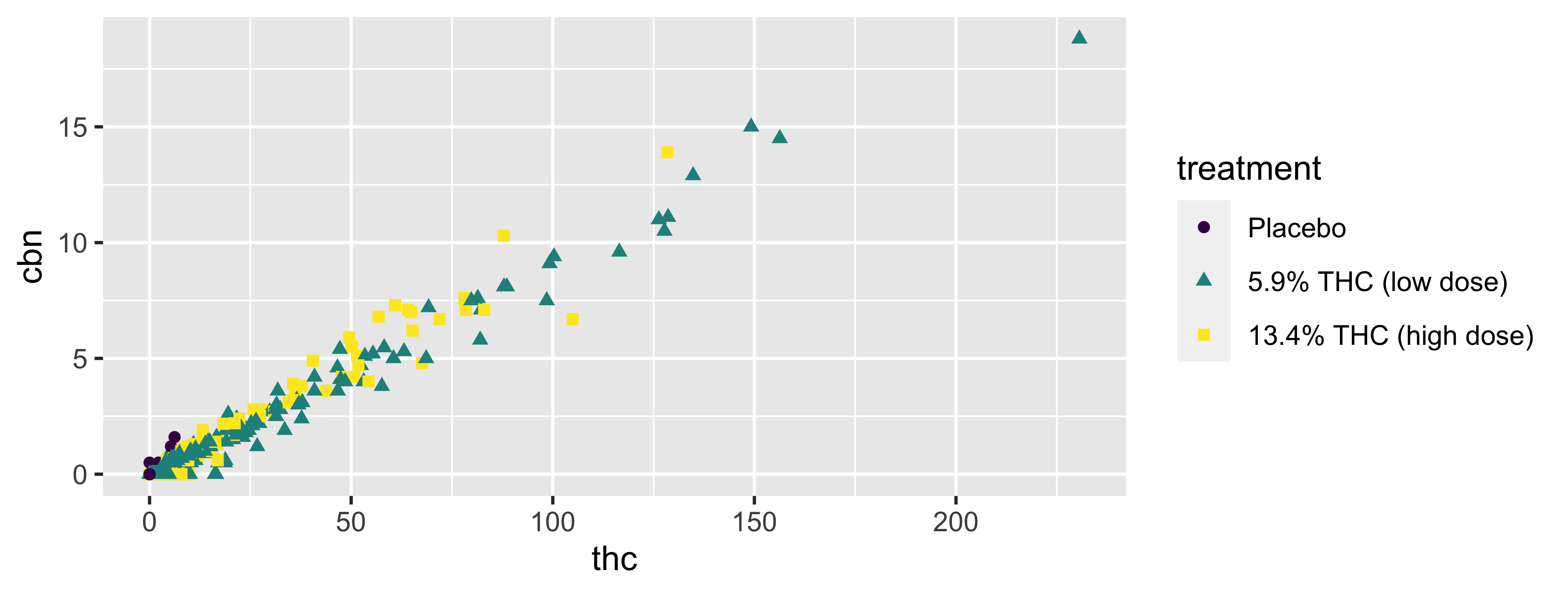
Commonly used characteristics of plotting characters that can be mapped to a specific variable in the data are
colorshapesizealpha(transparency)
Color
Shape
Mapped to a different variable than treatment
Shape
Mapped to same variable as color
Size
Alpha
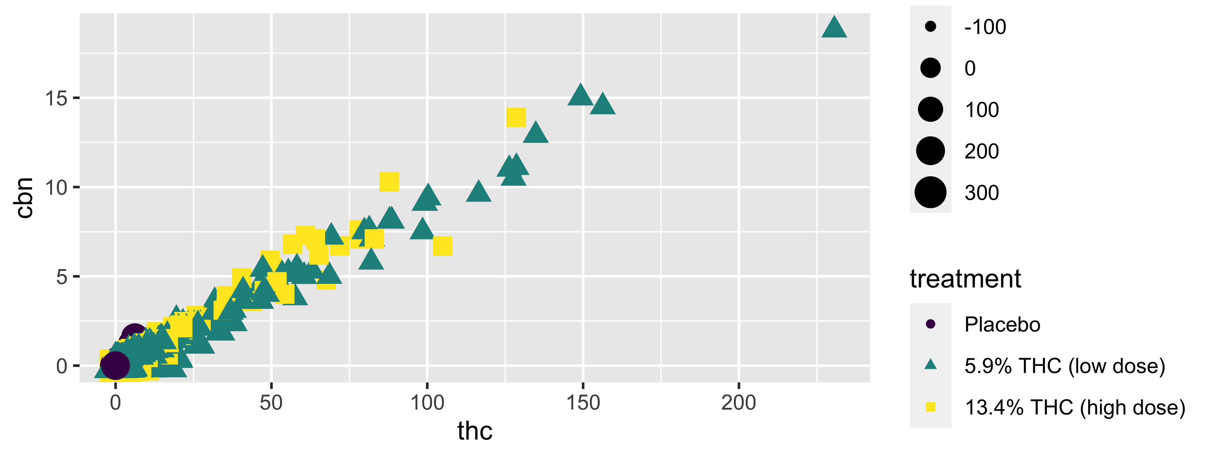
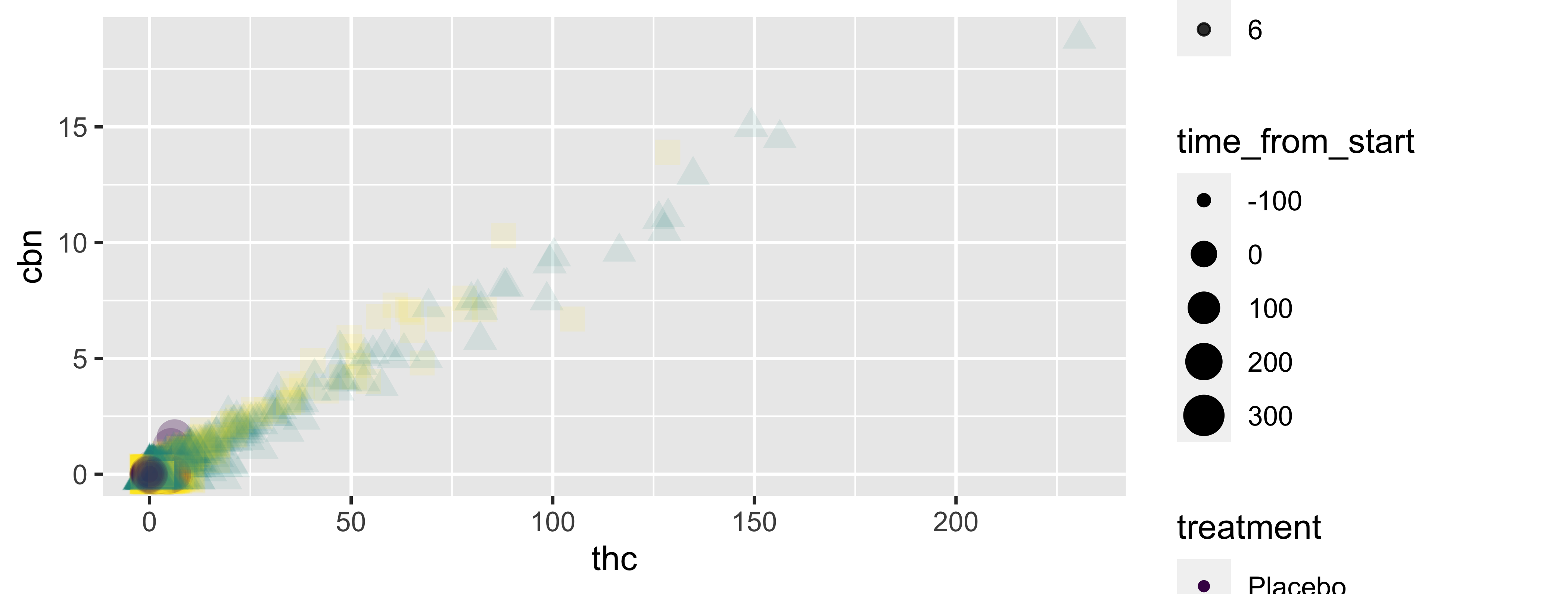
Mapping vs. setting
- Mapping: Determine the size, alpha, etc. of points based on the values of a variable in the data
- goes into
aes()
- goes into
- Setting: Determine the size, alpha, etc. of points not based on the values of a variable in the data
- goes into
geom_*()(this wasgeom_point()in the previous example, but we’ll learn about other geoms soon!)
- goes into
Mapping vs. Setting (example)
Mapping
ggplot(data = WB,
       mapping = aes(x = thc, y = cbn,
                     size = time_from_start,
                     alpha = cbd)) +
  geom_point() +
  scale_color_viridis_d()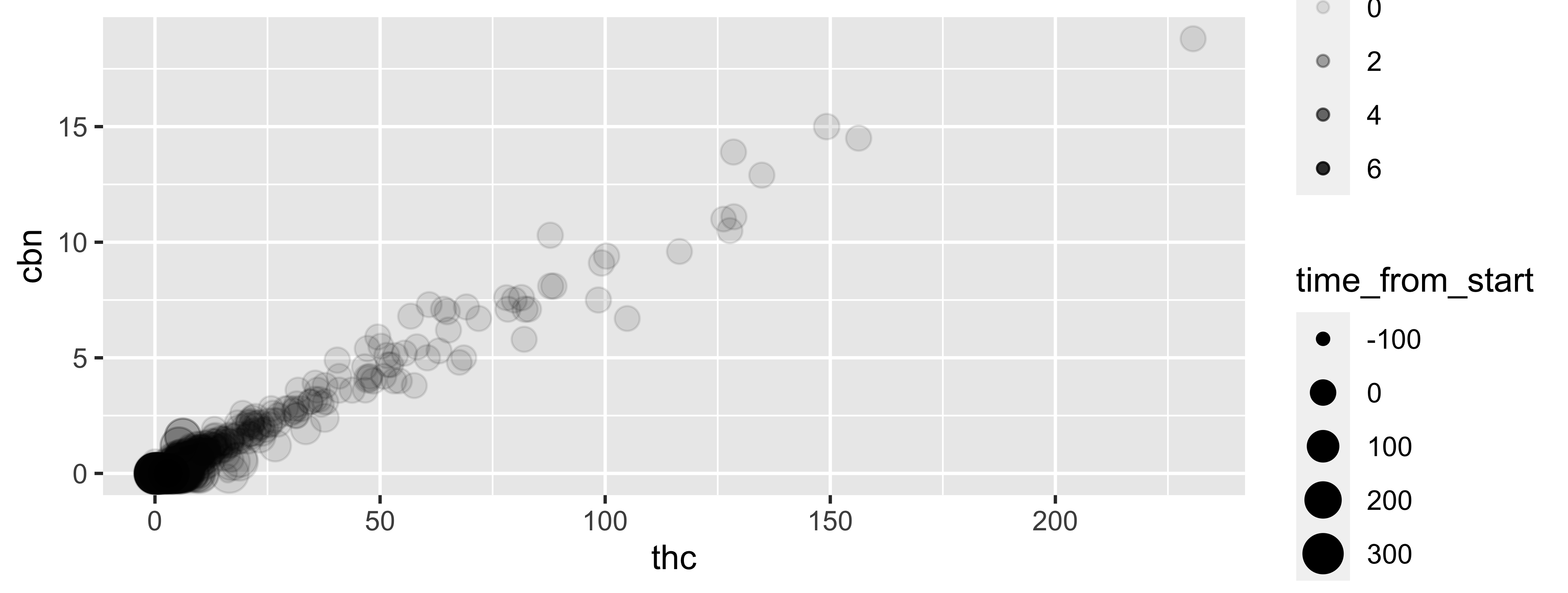
Setting
ggplot(data = WB,
       mapping = aes(x = thc, y = cbn)) +
  geom_point(size = 2, alpha = 0.5) +
  scale_color_viridis_d()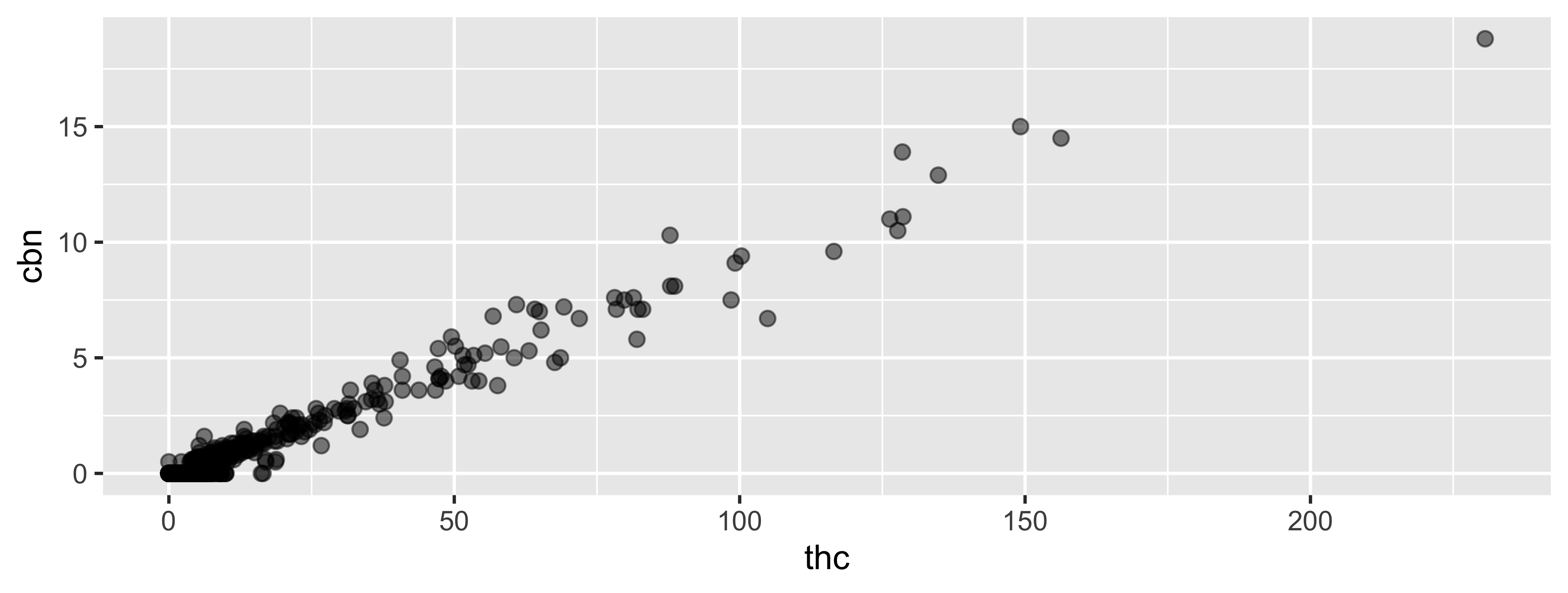
Your Turn
Edit the basic plot you created earlier to change something about its aesthetics.
Put a green sticky on the front of your computer when you’re done. Put a pink if you want help/have a question.
Faceting
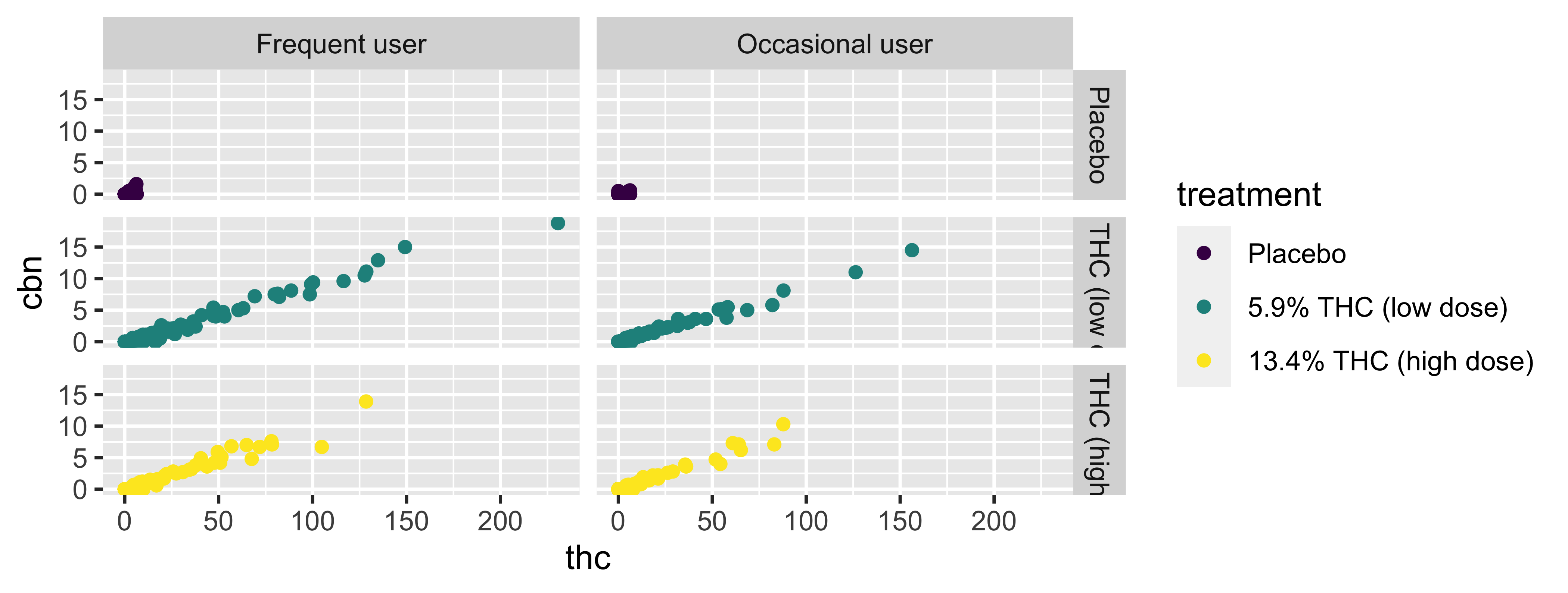
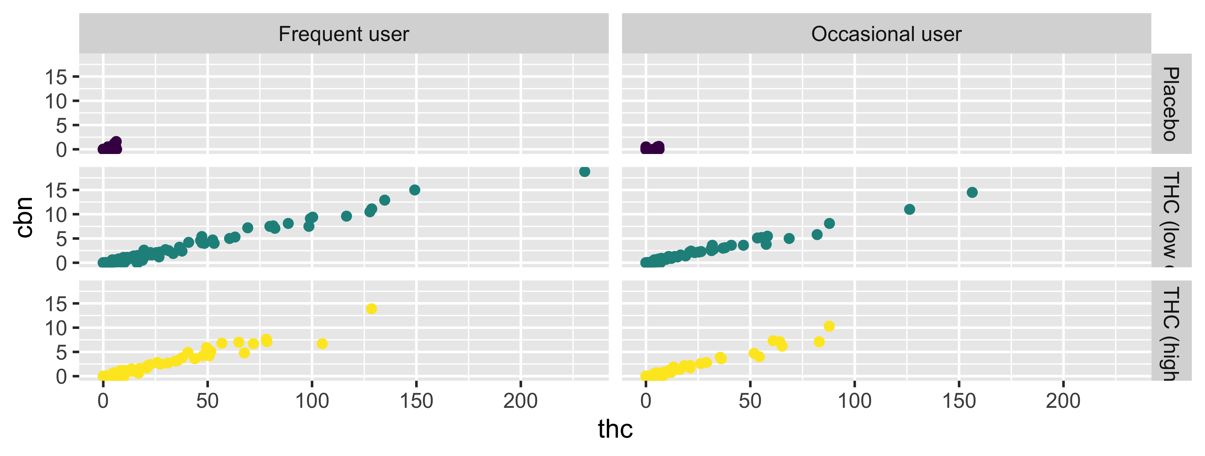
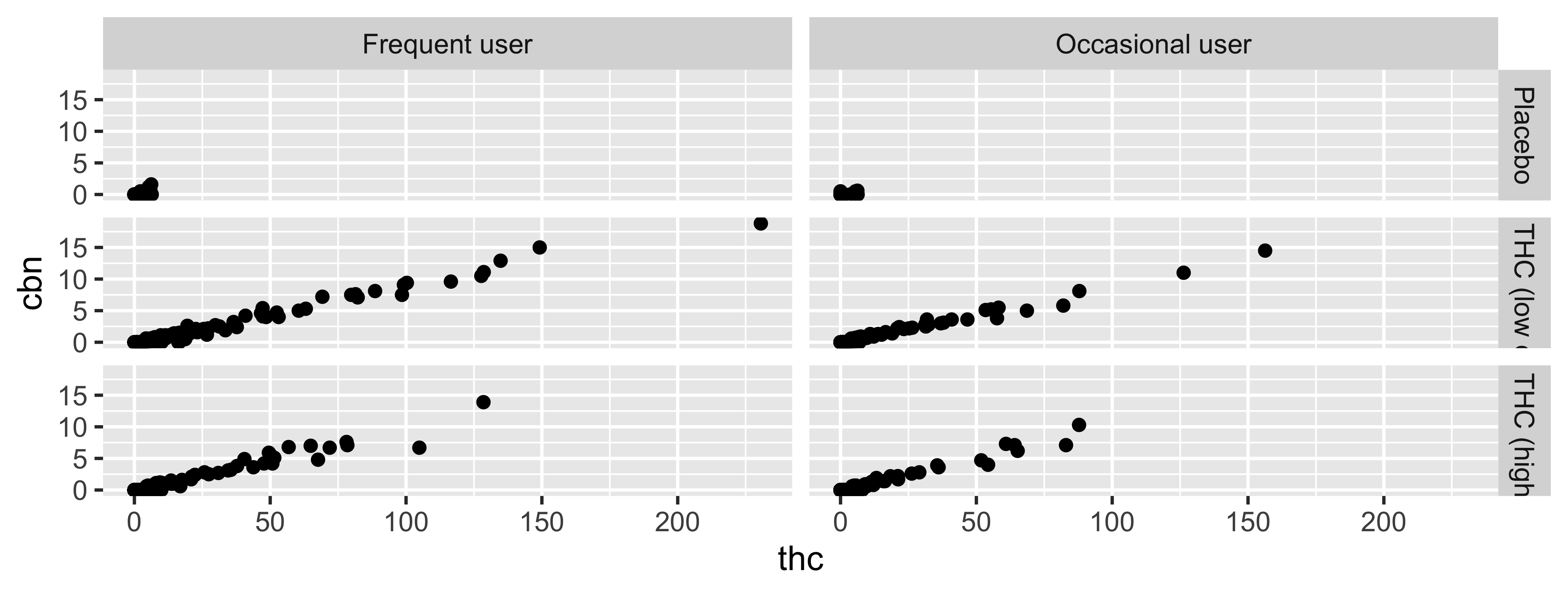
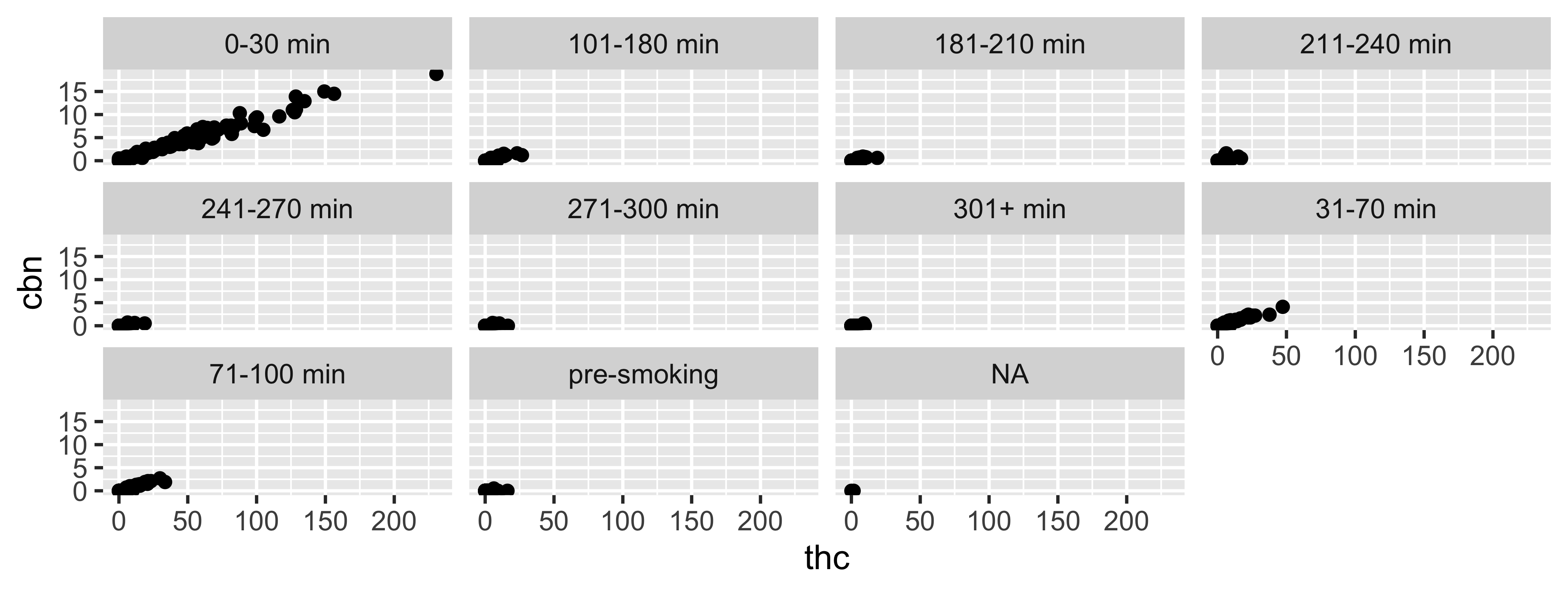
Faceting
- Smaller plots that display different subsets of the data
- Useful for exploring conditional relationships and large data
facet_grid
2d grid; `rows ~ cols
facet_wrap
“1d ribbon wrapped according to number of rows and columns specified or available plotting area”
Facet and color
Face and color, no legend
geoms
Common geoms
geom 1 |
Description 2 |
|---|---|
geom_point |
scatterplot |
geom_bar |
barplot |
geom_line |
line plot |
geom_density |
densityplot |
geom_histogram |
histogram |
geom_boxplot |
boxplot |
Your Turn
Generate a plot in ggplot2 using a different geom than what you did previously. Customize as much as you can before time is “up.”
Put a green sticky on the front of your computer when you’re done. Put a pink if you want help/have a question.
Recap
- Can I explain the overall structure of a call to generate a plot in
ggplot2? - Can I describe
ggplot2code? Can I create plots usingggplot2? - Can I explain the difference between mapping and setting?
- Can I alter the aesthetics of a basic plot? (color, shape, size, transparency)
- Am I able to facet a plot to generate a grid of figures
- Can I describe what a
geomis and do I know the basic plots available?
